How FoodNoms' New App Icon Boosted Download Conversion Rate by 10%
November 20, 2025

How much does an app icon matter? The question may surprise you (it did for me).
I created the original FoodNoms icon four years ago with Affinity Designer for iPad and Sketch. I've always had mixed feelings about the icon. While I love the iconic, bright orange background, I've never been too crazy about the spork shape. My main issue is that the glyph relies on being clipped to the bounds of the app icon squircle shape.

Last year, I commissioned an alternative app icon from Matthew Skiles. He and I worked together on the concept, and he did a stellar job executing and refining the vision. I was super happy with the end product. The new icon felt clever and original, while still retaining the FoodNoms brand.

Over the past few months, I've been increasingly focused on marketing. Part of these efforts have involved reaching out and asking random folks for first impressions about the app. I asked a few folks about the app icon. I was interested to hear that folks that never heard of the app before tended to prefer Matthew's icon. When I asked why, they said it looked more like an icon for macro tracking app (as opposed to a food delivery app or something else).
I recently learned that Apple made it possible for developers to A/B test their app icons. So for the past week and a half, 50% of all users who came across FoodNoms in the App Store saw the classic FoodNoms app icon, and 50% saw the new one.
Going into this experiment, I was already mostly sold on switching over to the new icon. But I wanted to make sure that it wasn't going to cause a negative impact on downloads.
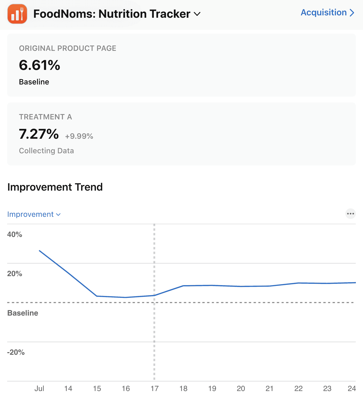
I was delighted to find out that it actually had the opposite effect – conversion rate (the estimated percentage of users who download the app after seeing the app in the App Store) with the new app icon is 10% higher! That's a big win! A 10% increase at the top of the funnel makes a huge impact on the entire business.

There was never a single day that the new icon underperformed the classic one. I was not expecting a statistically significant result, but alas, we have one in just a week and a half!
This made the decision easy for me. So as of today, FoodNoms has a new icon. There's also several new color variations of this icon that are now available.
If you're more of a fan of the original icon, no worries. You can switch back to it from the "App Icon" settings screen in the Settings tab of the app (only available on iOS and iPadOS at this time).
Misc. Learnings
In order to create an A/B test for the app icon, you must enable the "Include All App Icon Assets" build setting in Xcode for the iOS target. FoodNoms was previously using the old way of bundling alternate app icons, which wasn't compatible with product page optimizations in App Store Connect. Also, you must include an "App Store" 1024pt size for each alternate app icon you would like to test.
It seems that the App Store modifies the app bundle for users in the test treatment variations to completely replace the "AppIcon" asset with the alternate variation.
I did not expect this test to impact existing users. However, it did. I received several emails from folks that they had the "Chart" icon and weren't able to switch it to the default (due to the previous point). I wish the App Store was smart enough to exclude existing users from the test. I'm sure you could build a workaround for this, if you knew about it ahead of time.
Apple's confidence rating is seemingly stricter than a lot of statistical significance calculators out there. While other calculators considered the new icon a confident improvement over the baseline several days ago, Apple was still showing <20% confidence. (I ended the test today with an 81.7% confidence score as reported by App Store Connect and a 99% chance to outperform as reported by abtestcalculator.com.)